
This mobile-optimized infographic uses a striking hourglass metaphor to illustrate the urgency of the global water crisis. Just as sand runs out in an hourglass, our accessible freshwater supply is dwindling, with only 0.5% available for human use. The visual contrast between 97% saltwater and 3% freshwater emphasizes the scarcity of this vital resource, urging immediate action.
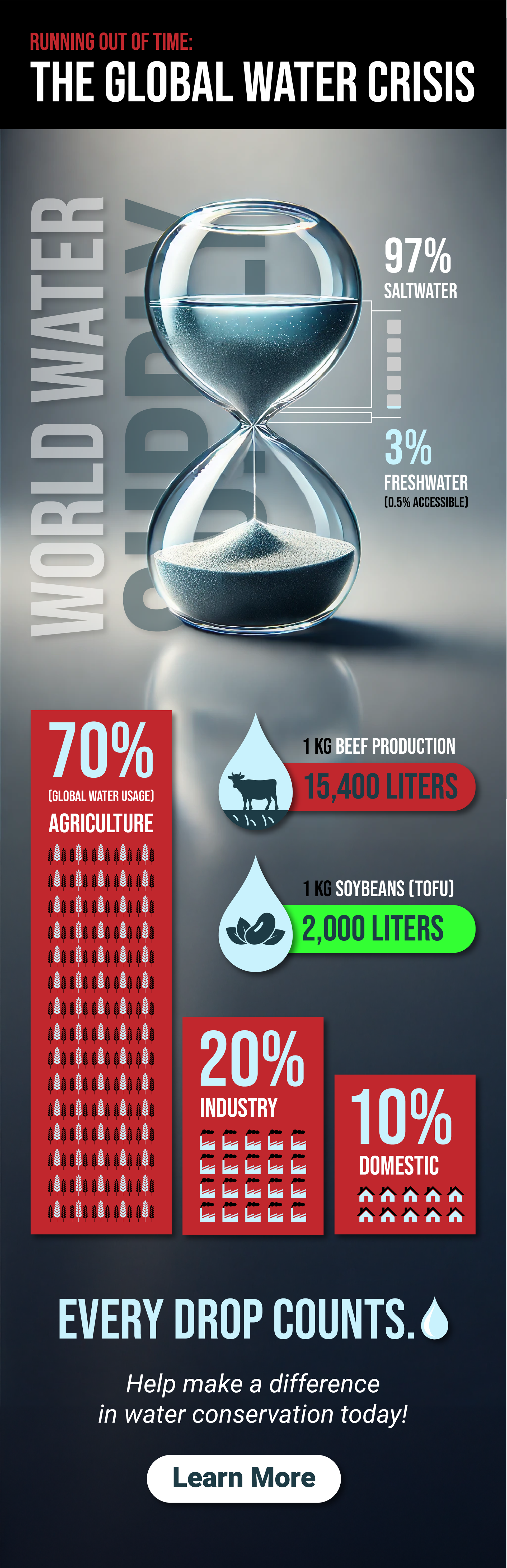

To make complex data easy to understand, the infographic employs icon-based data visualization, breaking down water consumption by agriculture, industry, and domestic use. Bold typography, color-coded elements, and drop shadows enhance readability, while compelling statistics—such as the 15,400 liters needed to produce 1 kg of beef—highlight the impact of our choices. By simplifying the numbers, this design makes a clear and urgent case for water conservation.