
For this project, I designed an original editorial layout for Horizon Magazine, a publication centered on space exploration and discovery. The magazine covers a wide range of topics, from human ventures into space to the discovery of distant solar systems. The title Horizon was inspired by the ever-expanding frontiers of human knowledge and the universe itself.
The visual design employs a space-themed color palette of deep purples, blacks, greys, and whites—evoking the vastness and mystery of the cosmos. The nameplate features two carefully selected typefaces: Orbitron for the Horizon title, which brings a geometric, futuristic feel in line with the magazine’s scientific content, and Montserrat for Magazine, offering a clean, modern touch with increased kerning to create balance between the two elements.
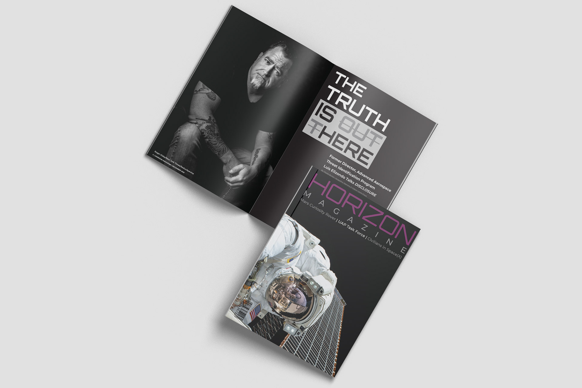
Cover and inner dps of horizon magazine, a fictional editorial (click Image to view flip book)
The editorial spread includes a custom cover design, a double-page table of contents, and a two-page profile article. For the article heading, I drew inspiration from the iconic '90s TV show The X-Files and its slogan, “the truth is out there.” To subvert this, I used a strikethrough on “out t,” transforming the slogan into “the truth is here,” a nod to the article's subject matter. This treatment comments on misconceptions often associated with the UAP (Unidentified Aerial Phenomena) community, tying in the theme of discovery and unveiling hidden truths.
The overall design aims to convey a sense of wonder and professionalism, creating a visually engaging and cohesive layout that invites readers to explore the farthest reaches of space.