In this project, I developed the brand identity and user interface (UI) for Wilson’s Property Maintenance, a local landscaping company. The goal was to create a professional, trustworthy, and approachable brand that resonates with a largely residential target demographic.
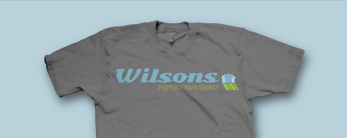
Wilson's Property Management logo on grey t-shirt
The logo is a combination mark, featuring a calming, natural color palette to evoke a sense of trust and community. The design incorporates a three-house icon, symbolizing the company’s focus on residential property maintenance and fostering a strong connection with homeowners. This cohesive brand identity aligns with the company’s mission to provide reliable, high-quality services.
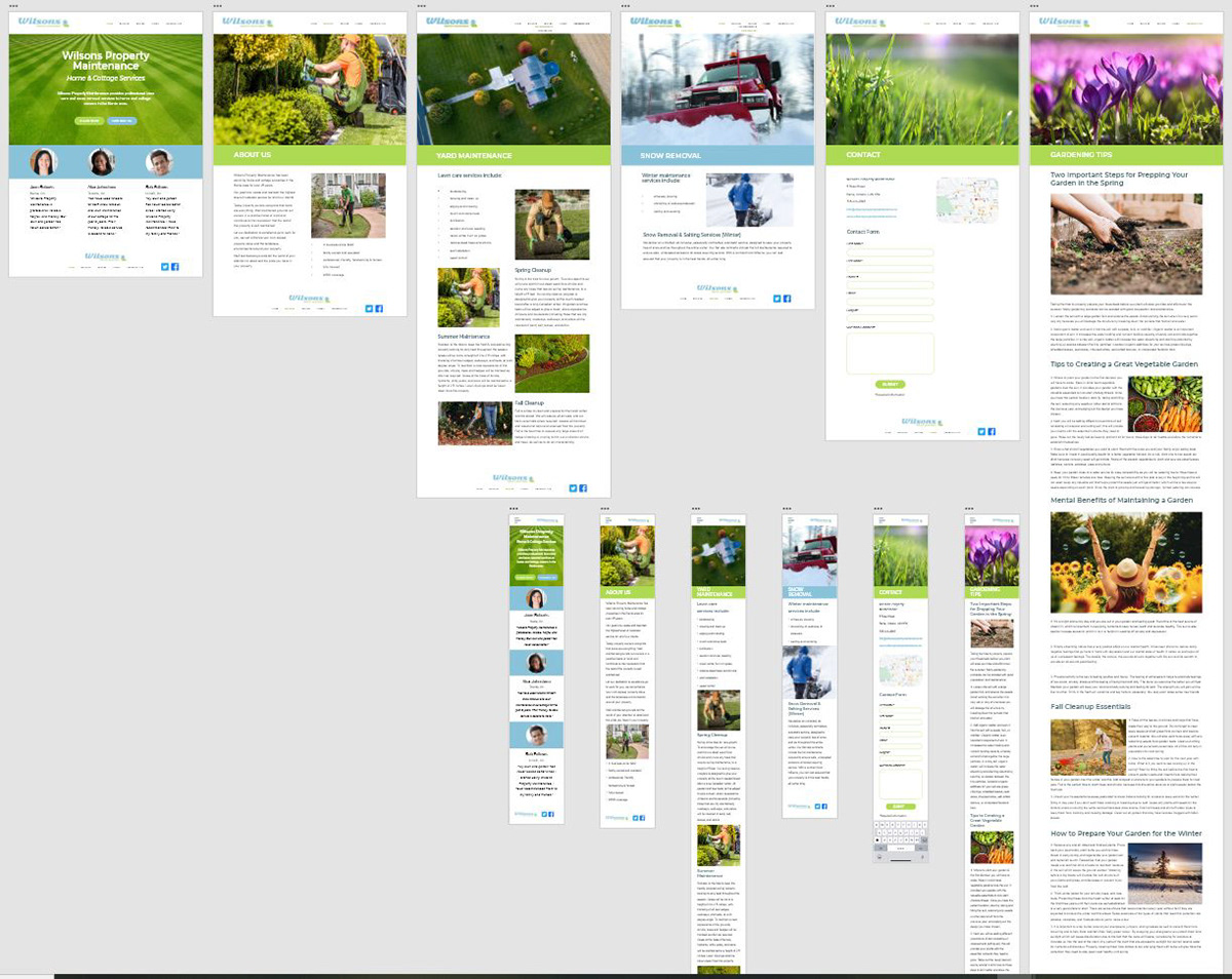
For the website, I designed a responsive UI prototype in Adobe XD for both web and mobile platforms. The layout prioritizes a clean and intuitive user experience, featuring clear type hierarchy, easy-to-navigate header and footer links, a search field, and prominent calls-to-action. The site is designed with user engagement in mind, offering a seamless journey from learning about services to getting in touch via a contact form, ensuring potential customers can easily connect with the company.